Queen of Peace
Osceola Indiana
Disclaimer
While I have been doing these tours for over a year now, the following photos were taken over a year ago, just as I was beginning to discover my love for church architecture. Thus, some of these photos are incredibly blurry. I know they are as such, have learned to take much better photos, and have even revisited some churches to take better photos. In short, I apologize for such poor quality photos
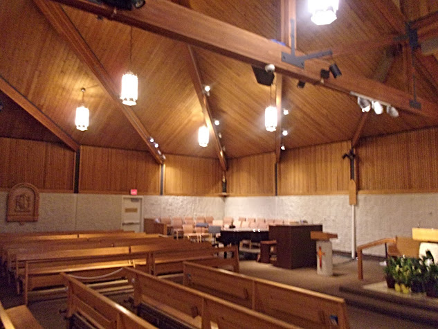
Queen of peace is one of the few churches in the Fort Wayne-South Bend diocese to be constructed after the 2nd Vatican council. This is evident in the very unique style of architecture that is the seventies.
Probably one of the most eye catching features about this church, is the large window thrust up into the air, like an escalator with an end but no destination.
Attached to the front of the church, or rear depending on which way you are looking, are the parish offices. The raised roof section was part of an original church/gym for the school. It now serves as the full time gym.
Atop the roof in plain sight, is the "bell tower." In reality, this doohickey is a set of speakers to broadcast bell noises. Both for Masses and school dismissal.
Queen of peace school, was a part of the church since its inception, but closed in the 1970s. Thankfully, due to the efforts of parishioner's, it was reopened in the nineties and has been going strong since. The way it was brought back was rather ingenious (albeit common for Catholic schools.) When it returned it was K-2nd grade, and every year a grade was added. Nowadays it serves children's all the way to middle school.
This quirky fresco was surrounding a skylight, in the vestibule. It doesn't take much of an art scholar to see that this is from the 1970, but the message and theology behind the mural is not all that far off. (If at all) The only thing I cannot understand is the painted railing, are the on a ship? (Bark of Saint Peter), are those the gates of heaven?
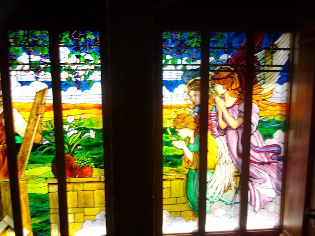
These stained glass windows were also in the vestibule, likely former windows of the church, or from a former church.
The state's glass in the church was a pleasant surprise. As seen at Saint Thomas and Elkhart, stained glass of the sixties onward is usually polygons arranged in some sort of nonsensical pattern designed to mean something. This is an anomaly, where not only are polygons nowhere to be found, but actual scenes and faces are present as well. To be fair however, these windows are not original to the church, and were added in the 1990's
It's also interesting to see, the departures from traditional sting glass apparel. For example, Jesus is almost always wearing red, and Mary is almost always wearing blue and white. Only Saint joseph is clad in trade traditional style apparel and colors
One thing I loved about these windows are the angels adoring the Word Incarnate from a silent and invisible distance. This is further emphasized by the separation in the window being a wall.
In the rear was a lovely shrine dedicated to our lady. Likely this was not this room's original purpose, either a sacristy, or a baptistry is my guess
Up in the ceiling, on the "escalator windows" as I've dubbed them, are 12 stained glass windows featuring the apostles. This has the classic 1950's feel of image mixed with polygons. If I had taken a better quality photo, one would be able to distinguish each Apostle by the clothes they wore and/or the symbols in the glass
Aside from the two large stained glass planes, and the glass at the top of the church, there was no natural light emanating anywhere in the church. Unfortunately. This resulted in a florescent hum that if concentrated upon, would drive any listener insane. Also note the unusually large stations of the cross. Re
The choir area. Unusually squished next to the sanctuary, and in a corner, this may seem odd, but unfortunately is the only area the choir sensibly could reside.
A blurry shot of the sanctuary. The reredos by the tabernacle are a recent addition, and add a splash of color in the orange wooded church. The six candles are traditionally spaced next to the tabernacle adding a bit of calm tradition in a wild seventies church. The out of place step up, is where the proctor's chair used to be.
An inscription on the confessional. Aside from a very contemporary font, the church heavily focuses the use of wood in its design.
Lastly, is the crucifix hanging above the altar. If I had to guess, it would most likely be that the crucifix was added at the same time the sanctuary was renovated. Crucifixes from the seventies tend to be a little odd in geometric proportions, as well as physical proportions.


No comments:
Post a Comment